Data and visual stories
I analyze data, read research, talk to lots of sources, and then write a story about my findings. Sometimes I also design charts, code interactives, and draw cartoons to tell the story.
I've spent a lot of time covering inequality, specifically in education and housing.
In pursuit of democracy
The Pudding

Analyzing every Congressional speech that mentions 'democracy'—and exploring our pursuit of this ideal.
30 minutes with a stranger
The Pudding
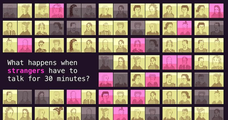
What happens when strangers have to talk for 30 minutes? Read the behind-the-scenes here.
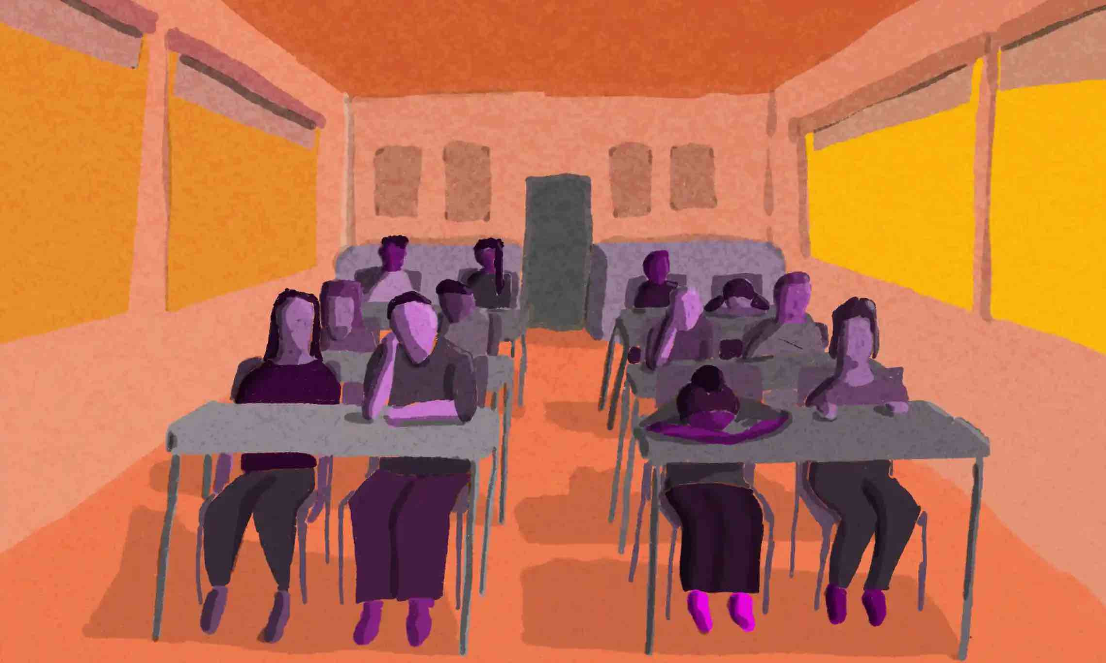
The Middle Ages
The Pudding
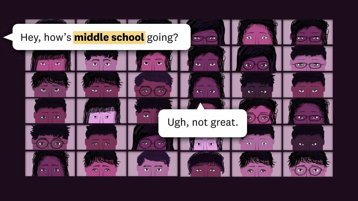
Did middle school suck for you? Turns out a survey of millions of schoolkids shows that you aren't alone. Watch the video version here. (I composed the music!) Read the behind-the-scenes here.
Sitters and Standers
The Pudding
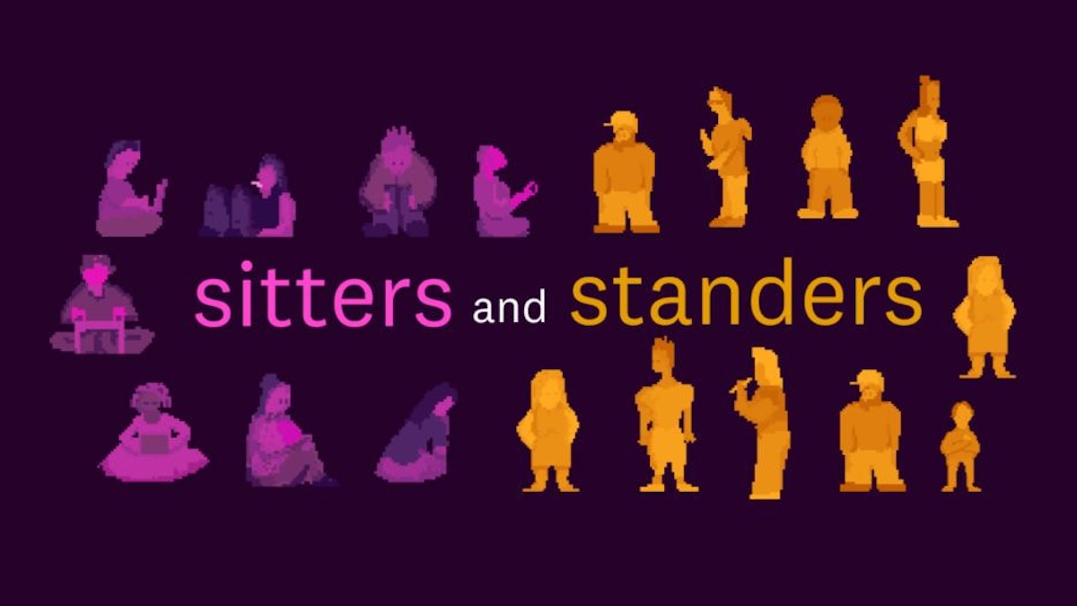
This project explores a divide in the American workforce: people who sit for a living, and people who stand. Read the behind-the-scenes here.
24 hours in an invisible epidemic
The Pudding
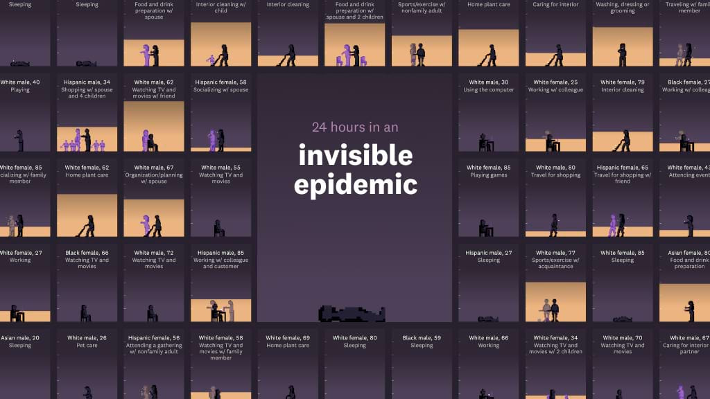
This project follows a group of Americans through 24 hours, and it tracks how much social interaction they get during the day. By the end of the day, we learn about an epidemic hiding in plain sight. Read about how this project was done.
Who killed the world?
The Pudding

Explore science fiction worlds from the last few decades – and what these fictional settings tell us about ourselves. Read the behind-the-scenes here.
Is your district using school zones to make segregation worse?
Vox.com
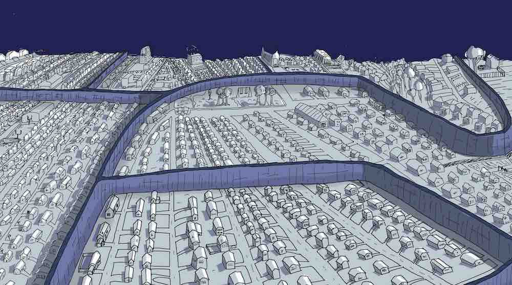
I worked with a researcher, Tomas Monarrez, to show how thousands of local school districts actively choose to make racial segregation worse. Journalist Nikole Hannah-Jones said this was "such important work." Former US education secretary John King said this was "powerful analysis." And the Education Writers Association awarded this story "Best Visual Storytelling." I talked to Open News about how this piece was done.
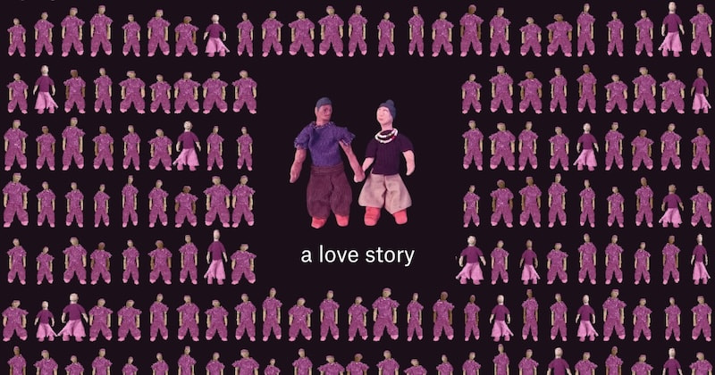
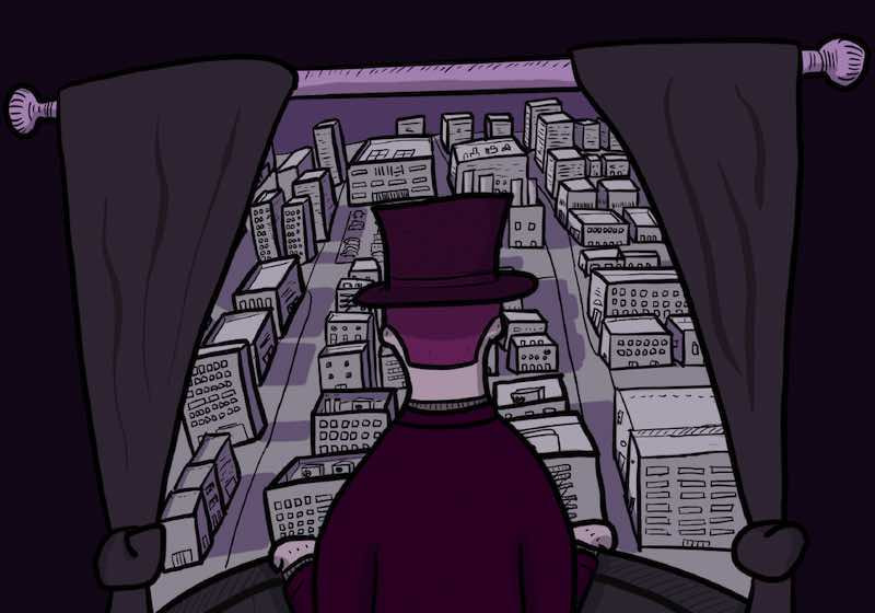
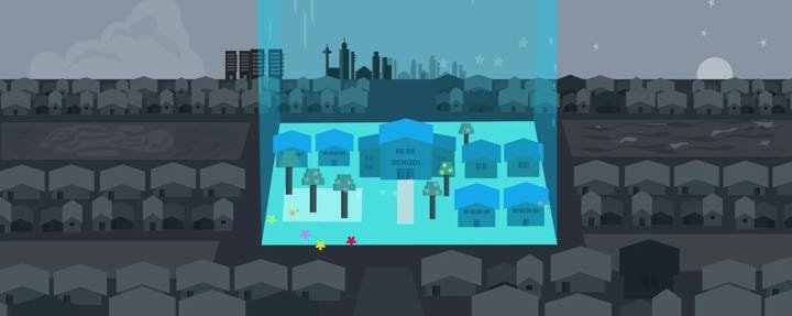
Living in a poor neighborhood changes everything about your life
Vox.com
I started this piece like I do every other piece: doing meticulous research, conducting lots of interviews, and analyzing loads of data. But when I sat down to write this story, I realized the best way to tell it was... a cartoon. And that's how "cartoonsplainers" were born. This piece is often used as required reading in university courses.
This is a teenager
The Pudding
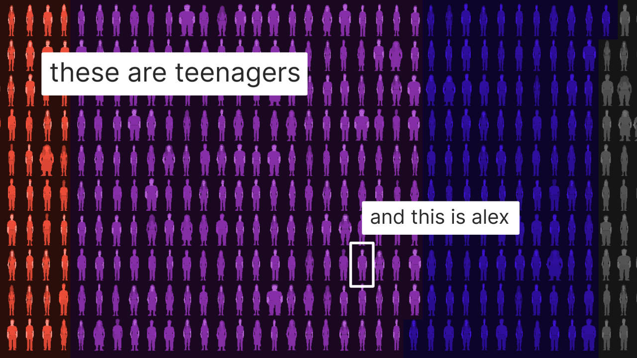
This project introduces hundreds of American teenagers in 1997, and then follows them for 24 years. How do their lives turn out? Read about how this project was done. This project won Gold at the Information Is Beautiful Awards.
How the internet keeps poor people in poor neighborhoods
Vox.com
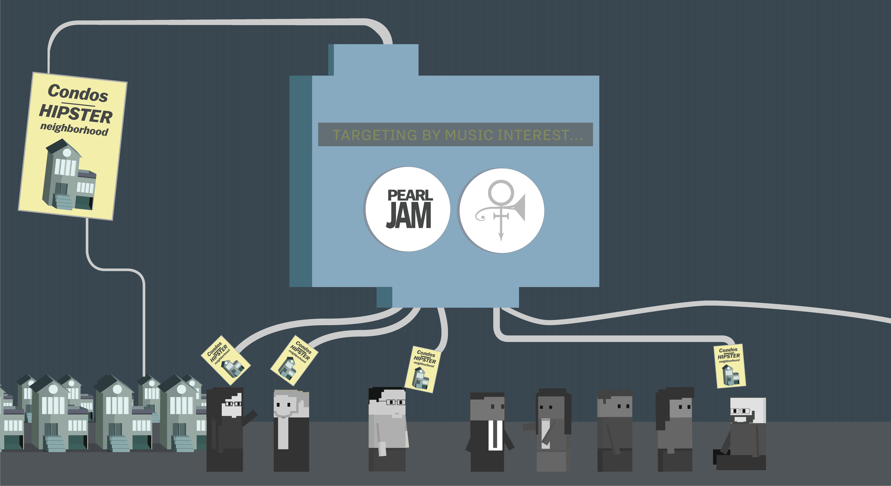
Visualization isn't just about representing data; it can also be used to show how complicated systems work. This piece uses GIFs to visualize an invisible phenomenon. The Asian American Journalists Association named this the best multimedia story in 2017. This piece was cited in an ACLU letter to the Consumer Finance Protection Bureau and in academic work.
Why the super rich are inevitable
The Pudding
Why do super rich people exist in a society? Many of us assume it's because some people make better financial decisions. But what if this isn't true? What if the economy – our economy – is designed to create a few super rich people? This piece explores the Yard-sale model, driven by research by physicists who argue that a completely free market leads to oligarchy.
Our food system isn't ready for the climate crisis
Guardian US
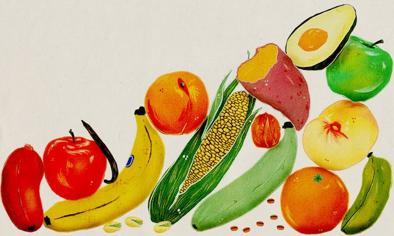
I worked with a team of reporters, editors, and visual journalists to tell the complicated – but important – story of what we eat.
The climate disaster is here
Guardian US
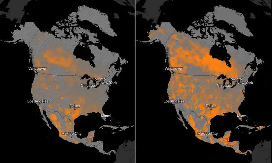
In the lead-up to the world’s most important climate conference, COP26, this story set the table by answering a very simple question: What is at stake for humanity? I helped guide a team of journalists to answer this question in a real and practical way. The story chronicles the various ways humanity can observe the warming climate: photos of extreme weather events already making regions unlivable; charts showing how close we are to catastrophic warming levels; and maps showing that virtually no community is safe from the increasing intensity and frequency of extreme weather events.
College scholarship tycoon, a game
Vox.com
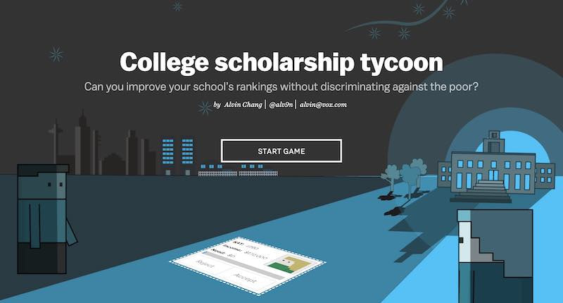
I created this simulation game from scratch, using the basic building blocks of HTML and Javascript. This piece started as a normal cartoonsplainer, but I realized there was a larger system I wanted my readers to understand, which is how it ended up looking like this. I used data and research to build the underlying game mechanics, and I used my reporting to create the rules of the game.
Sean Hannity has become the media’s top conspiracy theorist
Vox.com
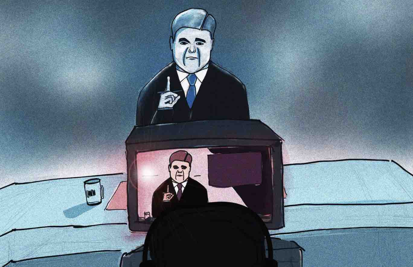
I analyzed of two years of Hannity transcripts, and I learned that since President Trump's election, the show pushed more conspiracy theories than any other news program. For this project, I scraped Reddit's /r/conspiracy and cross-referenced news programs with that content. My piece was references in a New York Times Magazine profile of Sean Hannity; he called it a "typical left-wing attack," and said he's been right when his colleagues have been wrong. Alex Jones called me a "soy boy" after this piece ran.
What tree rings reveal about America's megadrought
Guardian US
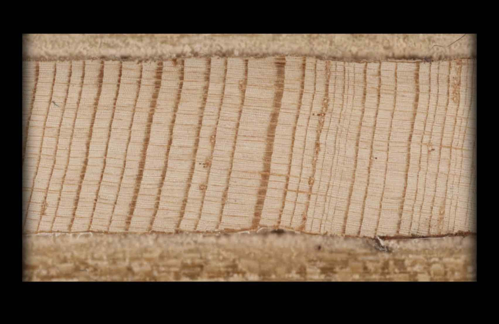
How do we know the American west is experiencing a historic drought? We can literally see it – in tree rings. This story started out as an explainer about what climatologists call a "megadrought," but it led me to these stunning tree ring images that I used to tell a story of just how unprecedented the current climate is.
How the US lets hot school days sabotage learning
Guardian US
Heat makes our bodies fritz out, and that includes the brain. But in thousands of classrooms around the nation, students have to learn in hot classrooms with no air conditioning. I worked with researchers to help readers look up their district and understand just how much learning the heat has cost students. I also talked to a handful of students who were not shy about telling exactly how difficult it is to learn when it's so hot.
We analyzed 17 months of Fox & Friends transcripts. It’s far weirder than state-run media.
Vox.com
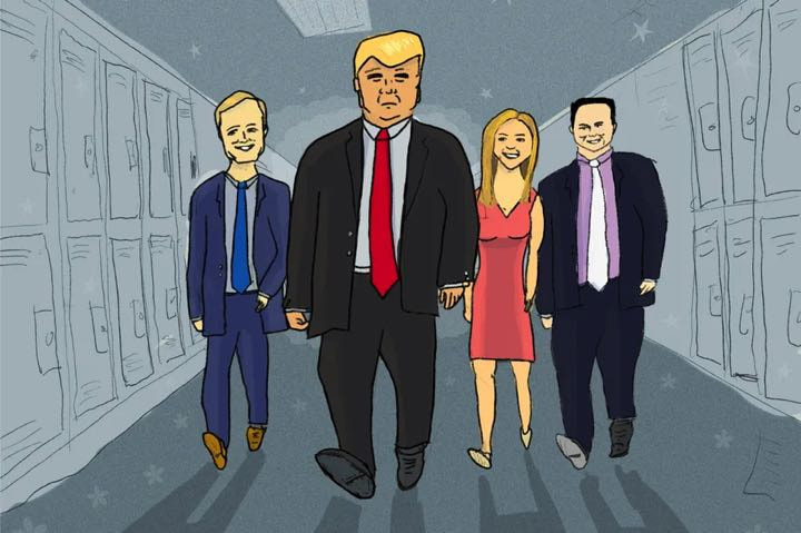
Early in the Trump presidency, Fox and Friends emerged as the president's favorite TV show. Critics often said this was akin to state television, but my analysis of transcript data showed that it was far weirder. The hosts weren't just going to bat for Trump – they were also advising him live, on air. I appeared on several radio and television shows – including CNN's morning show – to talk about these findings.
School segregation didn’t go away. It just evolved.
Vox.com
We often think of historical policies as the main culprit for school segregation. But affluent white communities have long fought to maintain the status quo, and this story shows perhaps the most brazen efforts to hoard resources and keep schools segregated.
The subtle ways colleges discriminate against poor students, explained with a cartoon
Vox.com
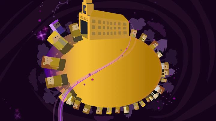
What are the things colleges value in their students? It turns out there are invisible biases we have in higher education that signal to less priveleged students that they don't belong. And the smallest changes – like acknowledging these biases – can help these students succeed.
Trump needs his alternate reality to survive — and he knows it
Vox.com
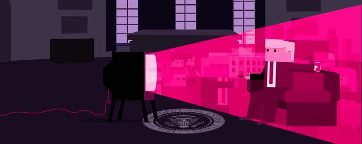
Right-wing media played a massive part in supporting Donald Trump's lies. This piece analyzes transcript data to show the stories Fox News suppressed and the ones it amplified. It ultimately shows why Trump needed Fox News's alternate reality to succeed.
Those who leave home, and those who stay
Vox.com
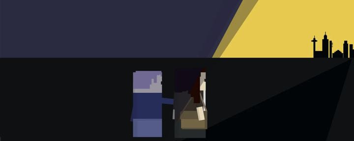
One of the strongest indicators of whether someone supports Donald Trump was whether or not they moved away from home. But it turns out this decision is often made for us, far before we make the decision for ourself.
100 years of tax brackets, in one chart
Vox.com
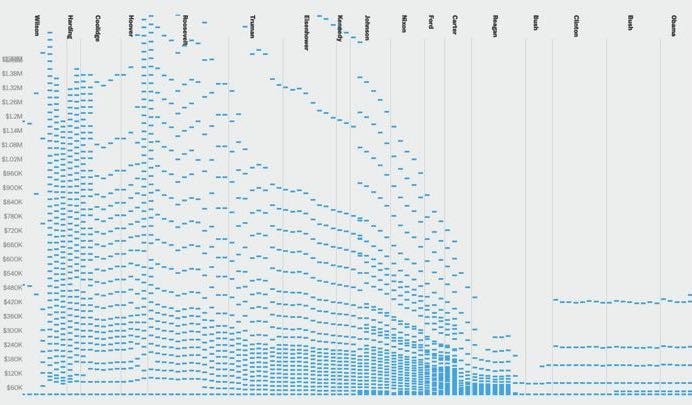
American tax brackets have radically changed in the last 100 years, often to benefit the wealthy. This interactive piece looks at how tax brackets have shifted over time. It was recognized in the book Best American Infographics.
Every time Ford and Kavanaugh dodged a question, in one chart
Vox.com
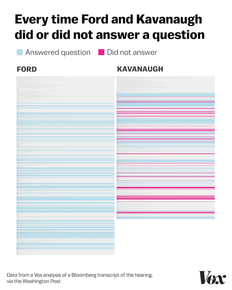
The morning after the Senate testimony of Supreme Court nominee Brett Kavanaugh and the woman accusing him of sexual assault, Christine Blasey Ford, I sat in bed reading through the transcripts. And I started noticing a trend: One person answered the questions; the other person didn't. So I turned this transcript into data and visualized it. Within minutes of publishing, the chart went viral. This piece was awarded "Best Use Of Data in Breaking News Story" from the Data Journalism Awards, and I was interviewed about this piece by Open News.